

Concrete has spent decades apologising for itself. The material that built parliaments, bus stations and university faculties across post-war Europe carried a reputation for coldness that took two generations to shake. Then something shifted. Walk into a contemporary Istanbul apartment or a new villa on the Bosphorus fringe and you find board-marked concrete beside bouclé, a monolithic plaster fireplace warmed by a wool rug, a raw stair rising against curtains in heavy linen. Our designers have watched this shift arrive in briefs from clients who once asked only for marble, and it has reshaped how we approach luxury villa interiors at every scale.
1- The original movement and what it actually valued
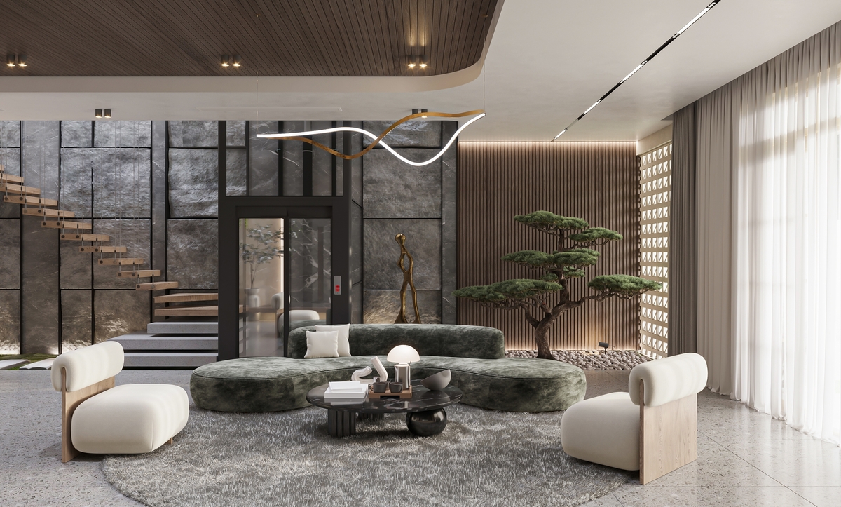
Brutalism grew from béton brut — raw concrete, the phrase Le Corbusier used for the material poured at the Unité d'Habitation in Marseille in 1952. The movement prized honesty above ornament: structure left visible, services left exposed, the imprint of the timber formwork kept as a record of how the building was made. Ornament was treated as a kind of dishonesty. Those founding principles, and the way contemporary studios have carried them into homes and workplaces, are something we have traced in detail before, and they explain why the style keeps returning while other post-war fashions stay in the archive.
2- The reputation problem it inherited
Public housing schemes and civic towers gave the style its bad name through weathering rather than design. Untreated concrete streaks in rain, stains where water runs, greys down where sunlight bleaches it. Add long corridors, small windows and minimal maintenance budgets, and the material carried blame for failures of planning and upkeep. The domestic revival corrects the record by putting concrete somewhere it performs beautifully — indoors, dry, lit properly, and used in measured quantity.
3- Softening begins with quantity
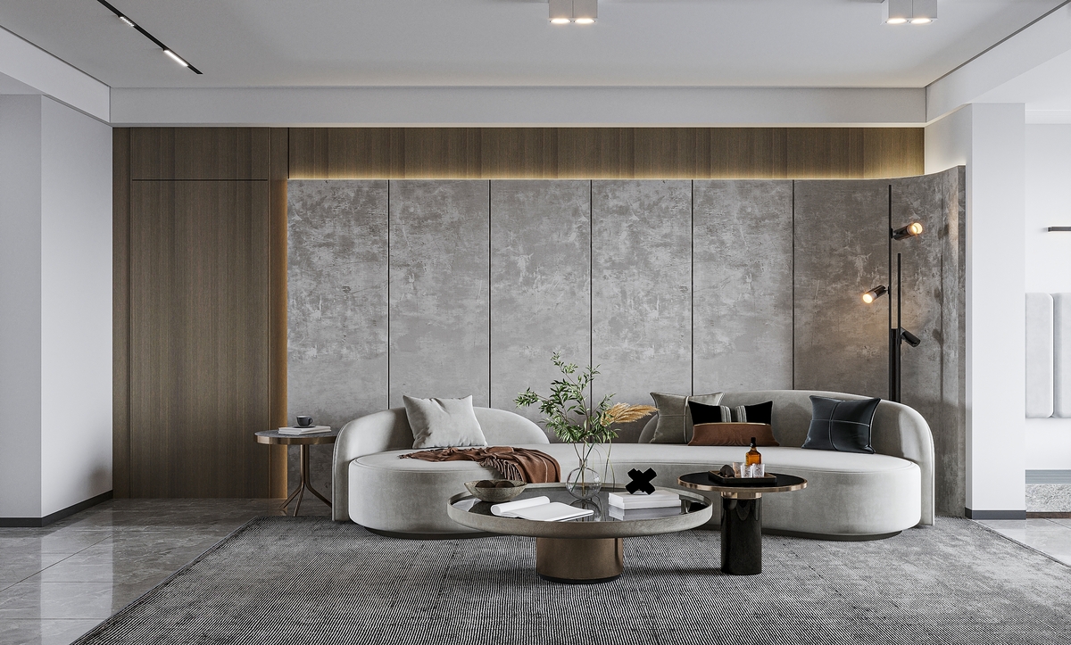
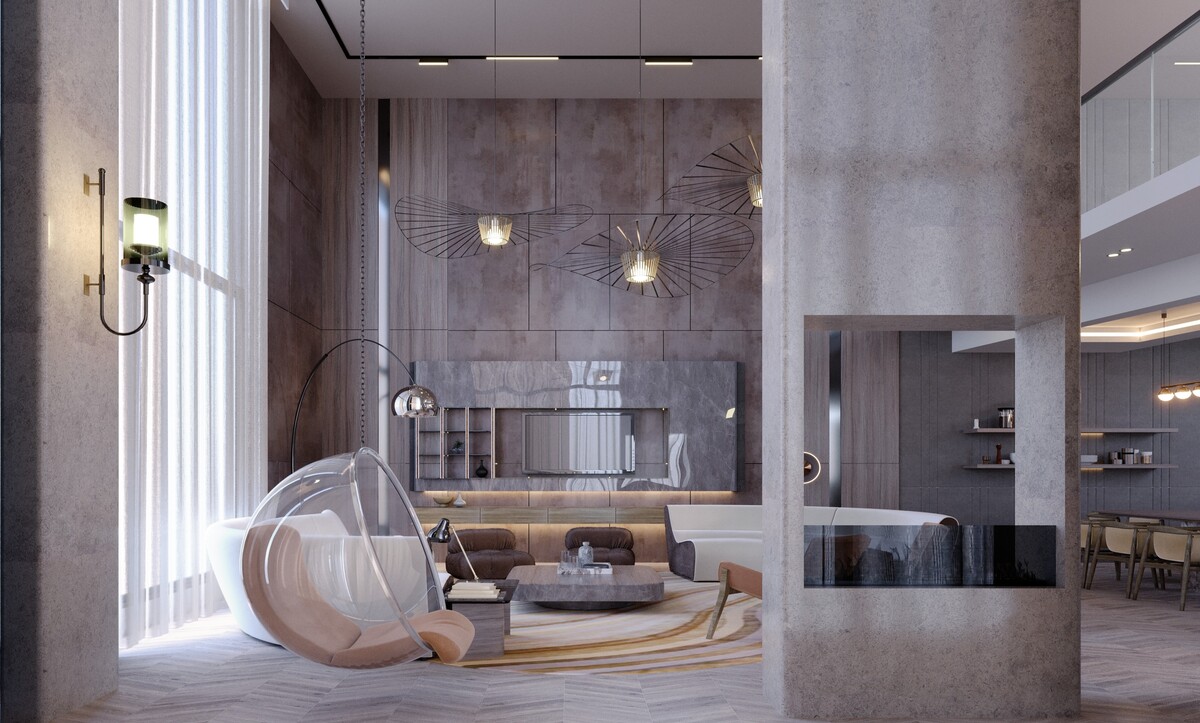
The first rule our designers apply is proportion. One concrete surface in a room reads as sculpture; four read as a bunker. A single board-marked wall behind a bed, a poured plinth carrying a fireplace, a stair with exposed soffit and everything else in warm plaster — the ratio hovers around one raw surface to every four soft ones. That restraint is what separates the current interpretation from its ancestor, and it shares its discipline with the calm palettes we describe in our guide to pared-back interiors.
4- Microcement and lime plaster do the heavy lifting
Very few of these interiors use structural concrete at all. Microcement laid at two to three millimetres over existing substrate gives the monolithic look with a fraction of the weight and none of the structural coordination. Tadelakt and lime plaster deliver something warmer still: a slightly undulating surface with depth in it, waxed to a soft sheen, cool to touch and quietly luminous under raking light. Stucco lucido belongs in the same family, polished to a marble-like glow across walls, vanities and bath surrounds.
5- Texture carries the warmth
Where the original movement relied on scale for drama, the domestic version relies on tactility. Board-marked finishes keep the grain of pine formwork pressed into the surface. Bush-hammered concrete reads almost like stone. Sandblasted panels catch light in a fine granular way. Set any of these beside bouclé upholstery, a hand-knotted wool rug, heavy Belgian linen and a slab of Canaletto walnut, and the eye reads the room as rich rather than austere. The contrast does the work; the concrete simply provides the ground.
6- Light became the second material
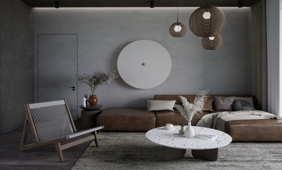
Contemporary brutalism treats illumination as part of the construction. Concrete responds dramatically to light striking it at a low angle — grazing wall-washers set close to the surface pull every board mark and aggregate speck into relief, while flat frontal light kills it entirely. Our teams specify warm colour temperatures around 2700K for living zones, keep 3000K for kitchens and dressing areas, and hide linear fittings in shadow gaps at the ceiling perimeter so the walls appear lit from within.
7- Curves arrived and changed everything
The sharpest break from the original vocabulary is geometry. Arched doorways cut through plaster walls, rounded plinth seating, drum-shaped concrete side tables, bullnosed island edges and vaulted ceiling forms all soften the silhouette while keeping the mass. A curved microcement wall reflects light in a gradient rather than a hard plane, which changes the emotional temperature of a room entirely. This blending of rigour with comfort follows the same logic our designers use when merging classic and contemporary registers in a single scheme.
8- Warm greys replaced institutional grey
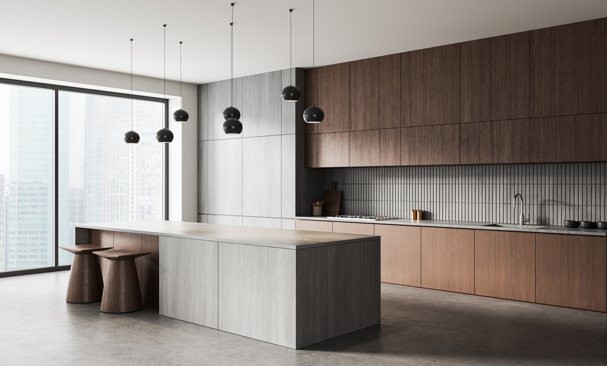
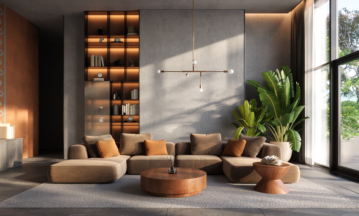
Colour explains much of the transformation. Post-war concrete leaned blue-grey, the tone of overcast winter. The current palette runs warm: greige, mushroom, oatmeal, clay, bone, and a putty tone somewhere between plaster and sand. Pigmented microcement lets our teams tune the base colour to the specific daylight of a site, warmer for north-facing rooms in Istanbul, cooler for interiors flooded with southern sun. Add oxblood leather, cognac velvet or deep olive for accent, and the scheme gains warmth with the structure intact.
9- Wood is the essential counterweight
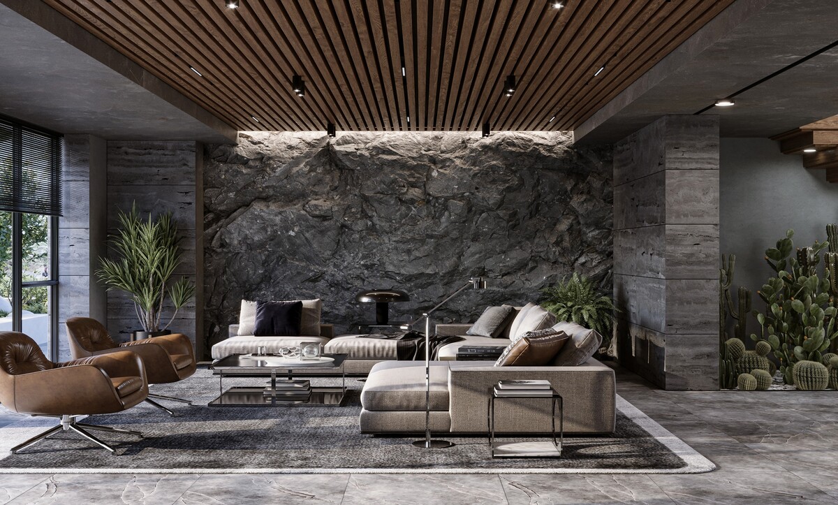
Every convincing scheme of this type leans on timber. Fluted oak panelling running floor to ceiling beside a raw wall. Solid walnut joinery with hand-pulled edges instead of hardware. Wide-plank European oak underfoot, brushed and oiled rather than lacquered, so the grain stays open. Wood carries visual warmth and acoustic benefit at once, taking the hard edge off reverberation in rooms full of dense surfaces — a consideration that also shapes how we handle workplace interiors built around exposed structure.
10- Acoustics deserve attention early
Concrete, glass and stone together produce reverberation times that make conversation tiring. Our designers plan absorption from the outset: heavy curtains stacked generously, wool rugs with thick underlay, upholstered headboards, slatted timber panels backed with acoustic felt at NRC 0.7 or above, and micro-perforated plasterboard ceilings finished in the same plaster tone so the correction stays invisible. A living room that measures under one second reverberation feels calm even with three raw walls in it.
11- Japanese thinking gave the style its patience
Much of the softening came from an eastern influence. Wabi-sabi taught a tolerance for irregularity — the hairline crack, the trowel mark, the patina that arrives with age — which suits concrete perfectly, since the material continues changing for years after it cures. Restraint in object count, generous empty surface and a reverence for natural fibre all migrated across, and the results sit close to the philosophy behind Japandi-style kitchens, with their honest materials and quiet cabinetry.
12- Metal, glass and the memory of glamour
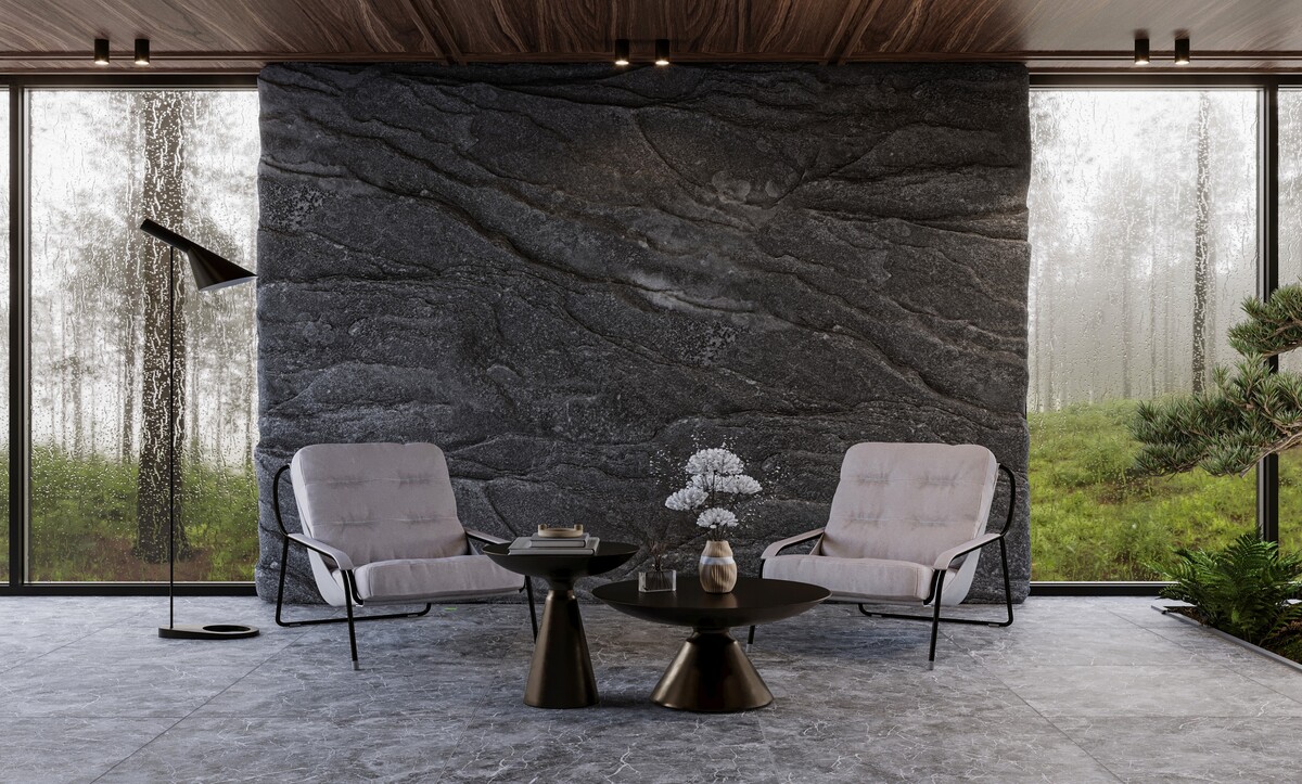
A little polish keeps these rooms from turning monastic. Brushed and antique brass on handles, tapware and slim shelf edges introduces a glow against grey. Bronzed and antiqued glass in cabinet fronts and screens adds reflection with depth. Alabaster shades and Murano crystal pendants give a single point of luxury above an otherwise sober table. That measured application of shine borrows directly from the geometric confidence explored in our look at inter-war decorative style.
13- The facade version of the same idea
Outdoors, the vocabulary translates with equal success across Turkey and the Gulf. Deep concrete overhangs shade glazing from summer sun. Fair-faced panels sit alongside travertine cladding and slatted timber screens. Perforated screens filter light while keeping privacy on close-set plots. Our exterior teams handle these compositions through villa facade and exterior design, balancing mass and shadow so the building reads sculptural from the street.
14- Planting completes the transformation
Greenery finishes the job that texture starts. Olive trees with silvered leaves against a grey wall, tall grasses moving in wind beside a static plane, a fig or a large-leafed monstera indoors breaking a hard corner — living material against inert material creates the exact tension the style needs. Our landscape designers treat gravel courtyards, board-marked planters and single specimen trees as extensions of the architecture rather than decoration applied afterwards.
15- Rooms that suit the approach best
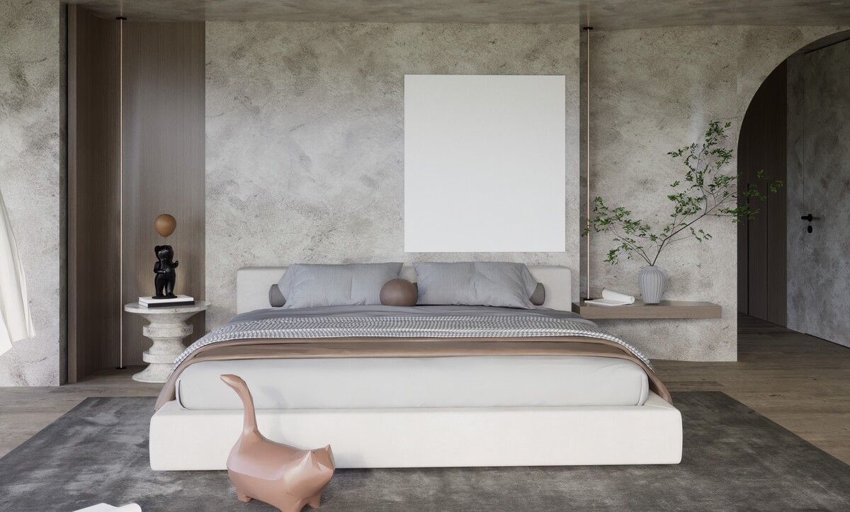
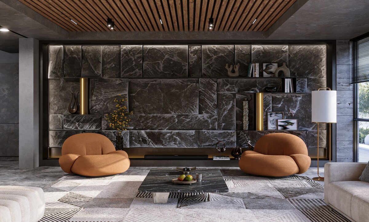
Certain spaces take to it immediately. Entrance halls gain drama from a single monolithic plane. Bathrooms in tadelakt read as spa-like caves, warm underfoot with heating below. Kitchens with microcement islands and integrated drainage grooves stay handsome for decades. Bedrooms need the gentlest hand of all: one textured wall behind the bed, layered bedding, curtains to the floor, and lighting kept low and warm. Examples across our completed design galleries show the balance holding across room types and property sizes.
16- The lasting appeal
What makes this interpretation durable is its honesty about how people live. The original movement wanted buildings to declare their construction; the domestic version keeps that declaration and adds comfort, acoustics, warmth and patina. The result ages gracefully, needs very little maintenance, and photographs superbly under afternoon light. For our studio, it has become one of the most requested registers in residential interior design across Istanbul and the wider region.
Considering a scheme built on concrete, plaster and warm timber? Talk to our design team about your villa, apartment or workspace — contact Algedra to arrange a consultation.