

There is a particular quality of light in Copenhagen during the middle of January. It arrives late, sits low, and crosses a room at an angle that flatters very little. Danish interiors have spent a century learning to work with that condition, and the result is a palette that has travelled far past the harbour city it belongs to. Designers now call it Copenhagen Pale: a family of bone whites, oat greys, chalked pinks and cool clay tones that behave beautifully under weak northern sun and hold their composure under almost every other kind of light as well. Our design team has been building this range into projects across Istanbul and the Gulf for several seasons now, and it has become one of the most requested directions in our villa interior design work.
The palette has arrived at an interesting moment. After several years of saturated colour, of oxblood dining rooms and forest-green libraries, clients are asking again for interiors that recede. Copenhagen Pale answers that request with more substance than the all-white minimalism of the 2010s ever managed. It carries warmth. It carries texture. It rewards close looking.
The colour family, from chalk to clay
Copenhagen Pale describes a spectrum rather than a single shade, and understanding the full range separates a room that glows from a room that reads as unfinished.
At the coolest end sit the chalk whites: pigments with a faint grey undertone, closer to limewashed plaster than to gallery white. We use these as base tones on walls and ceilings, applied in matt or near-matt finishes that absorb light instead of bouncing it back at the eye.
Moving warmer, the family opens into oat, bone, raw linen and unbleached paper. These carry a yellow-grey undertone and do the heaviest lifting in any pale scheme. They are the tones of undyed wool, of pale ash timber, of parchment. Spread across upholstery and curtains, they supply the softness that keeps such a room from turning clinical. Much of the underlying thinking here descends from the Nordic approach to daylight and muted tone that our studio has written about at length, though Copenhagen Pale pushes further into the greys and clays than classic Scandinavian schemes ever did.
Then come the muted mid-tones, which supply structure: putty, mushroom, warm greige, dove. These appear on joinery, on larger case pieces, on rugs and on the occasional painted wall. Quiet enough to belong to the family, dark enough to give the eye somewhere to rest.
Finally, the accents. Copenhagen Pale accepts colour, provided the colour has been drained of intensity. Chalked rose, dusty sage, faded terracotta, pale ochre and a smoked blue-grey all sit comfortably inside the scheme. The governing rule is saturation rather than hue. A dusty pink cushion belongs here. A hot fuchsia one belongs somewhere else.
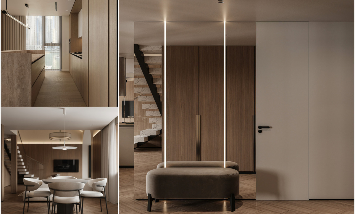
Reading the light before choosing the paint
The most useful thing to understand about this palette is that it was developed for one specific light condition and behaves differently under others.
Northern European daylight is diffuse, cool and low in intensity. Pale tones under that sky appear soft and slightly grey, which is precisely why the warm undertones in oat and bone matter so much — they keep the room from drifting cold. Istanbul light is another proposition entirely: brighter, warmer, far more directional, and shifting dramatically between a north-facing hillside in Zekeriyaköy and a south-facing apartment on the water. Our designers see the difference most sharply in homes that open directly onto the Bosphorus, where reflected light from the strait carries a silver-blue cast into the room for most of the day.
The practical response is to shift the undertone slightly cooler in high-sun conditions. Choose a chalk white built on a grey base rather than a cream base. Specify linen upholstery in a stone tone rather than a sand tone. We test large samples on several walls in each project and observe them across a full day, paying particular attention to the hours of strongest sun, when warm undertones amplify most aggressively.
Artificial lighting deserves equal scrutiny. Copenhagen Pale collapses under cool white LEDs. The palette wants warm light, ideally in the 2400K to 2700K range, delivered from multiple low sources rather than one ceiling fitting. Danish homes habitually use several small lamps at varying heights, and the effect on a pale scheme is substantial: pools of warm light give the eye contrast and depth that flat overhead illumination flattens away.
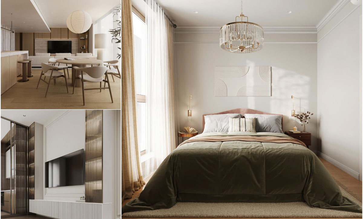
Material texture carries the whole scheme
A room assembled from four barely distinguishable tones needs something other than colour to hold interest. That work falls to surface and texture, and it is the aspect of Copenhagen Pale most frequently underestimated by homeowners attempting it alone.
The palette becomes convincing when it moves through a wide range of tactile qualities:
Limewash or clay paint on walls, producing a mottled, chalky depth that flat emulsion struggles to replicate
Pale timber with visible grain — white oak, ash, birch — for flooring, joinery and furniture frames
Boucle, brushed wool and heavy linen on upholstery, giving shadow and pile at close range
Raw or waxed plaster on feature surfaces such as fireplace surrounds and kitchen backsplashes
Paper, rice paper and parchment shades on lighting, diffusing the source rather than aiming it
Unglazed ceramic and stoneware, matt and slightly irregular, for vessels and lamp bases
Marmara white, Afyon Sugar and travertine, all quarried in Turkey and all sitting naturally inside this tonal range
The principle underneath every one of these is honest material. Copenhagen Pale performs best when surfaces are what they claim to be: real timber with real grain, real plaster with real irregularity, real wool with real weight. Laminates and printed finishes struggle in this palette because they lack the micro-variation that makes a pale surface interesting from thirty centimetres away.
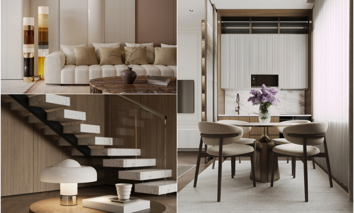
Form, proportion and the Danish lesson in lift
Danish furniture design supplies the natural companion to this palette, for structural reasons rather than nostalgic ones.
Mid-century Danish pieces favour slim legs, lifted volumes and generous space beneath the seat. In a pale room that lifted quality matters enormously: light travels under and around the furniture, keeping the floor visible and the whole room airy. Heavy skirted upholstery and floor-hugging case goods sit dead in such a scheme, soaking up light and creating weight the designer had no intention of adding.
Curved silhouettes have entered the palette more recently and belong there comfortably. A rounded boucle armchair, a kidney-shaped travertine coffee table, a softly arched opening between rooms — each one softens geometry that pale schemes otherwise risk. Balance is worth watching. Alternate curved and rectilinear pieces so the room reads as considered work.
Scale should stay generous. Copenhagen Pale rewards fewer, larger objects over many small ones. A single substantial ceramic vessel on a console carries more presence than a cluster of accessories, and it preserves the calm the palette exists to deliver.
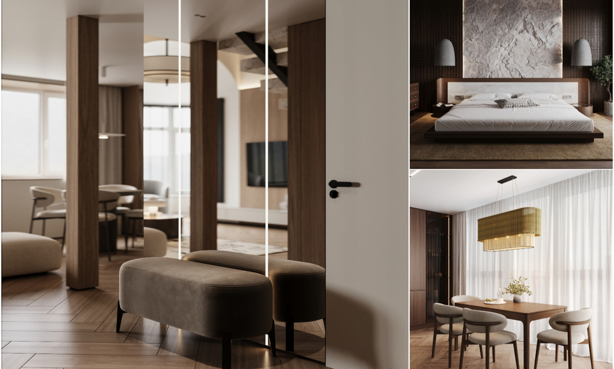
The anchors that keep a pale room from floating
Every successful pale scheme contains two or three points considerably darker than everything around them. Without those anchors the eye finds nowhere to land and the whole room reads as washed out.
We introduce them through material rather than paint: a smoked oak sideboard, a blackened steel floor lamp, a charcoal ceramic lamp base, a bronze-framed mirror. The contrast belongs at object scale rather than wall scale, which keeps the pallor dominant while giving the composition a spine. Architecture can carry the same job — a fair-faced concrete wall or an exposed structural beam reads as an anchor in exactly this way, and clients who admire the heavier concrete language softened for domestic use often find that a pale palette is the most sympathetic backdrop that architecture can receive.
Metalwork deserves a note. Brushed brass, antique bronze and blackened steel all work here. High-polish chrome and mirror-finish gold introduce a sharpness at odds with the softness everything else is building, so we reserve those for schemes with more colour behind them.
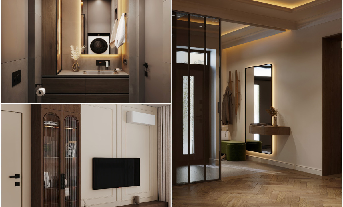
Living rooms and the tonal ladder
The living room carries the palette most naturally, and it is the space where our residential interior design teams apply Copenhagen Pale most often.
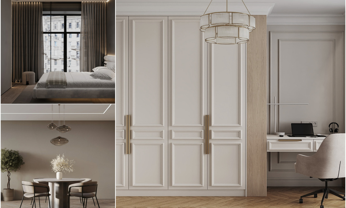
A working formula: chalk walls, pale oak floor, an oatmeal sofa, a wool rug one step deeper in putty, curtains in unlined linen hung high and full. On top of that, two anchors and one point of gloss. The tonal ladder from near-white to mid-grey gives the room dimension, and the whole composition holds together because every step belongs to the same family.
Seating layout matters more than usual in a pale room. Grouping furniture toward the centre and leaving the perimeter clear preserves the sense of air that justifies the palette in the first place. Pushing everything to the walls produces a hollow middle and a room that feels arranged rather than lived in.
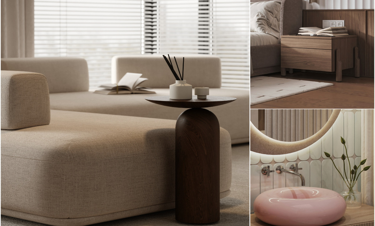
Bedrooms built from layered textiles
Bedrooms suit this palette exceptionally well, and the depth comes almost entirely from fabric.
Linen bedding in three closely related shades — bone, oat and pale grey — creates dimension across the bed without introducing pattern. A limewashed wall behind the headboard adds shadow to the surface the eye rests on longest. Wool throws, a sheepskin at the foot of the bed and heavy curtains complete the layering. Several of the styling principles our designers apply to Turkish bedrooms translate directly into this palette, particularly the habit of building interest from material weight rather than from colour.
Lighting in a pale bedroom wants three separate levels: a warm ceiling source on a dimmer, bedside reading lights with directional heads, and one low ambient lamp for evening. The palette responds to that layering more visibly than a darker scheme would.
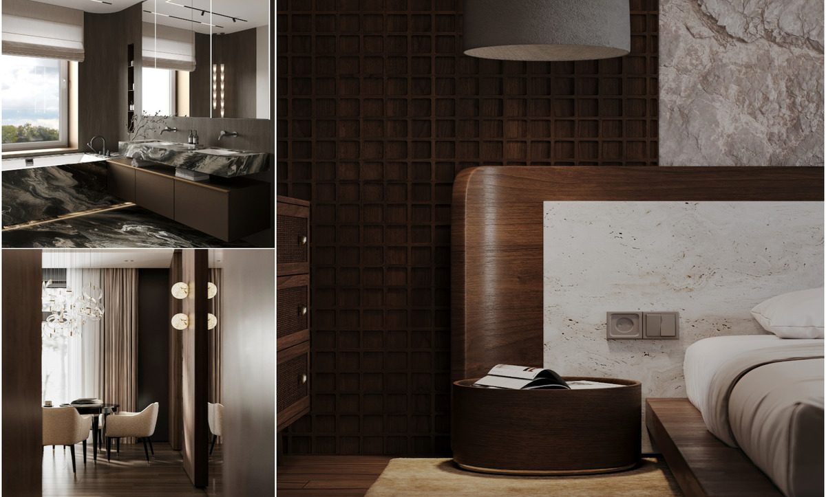
Kitchens, joinery and continuous surface
Kitchens move the palette firmly into joinery, and the decisions get made at cabinet level.
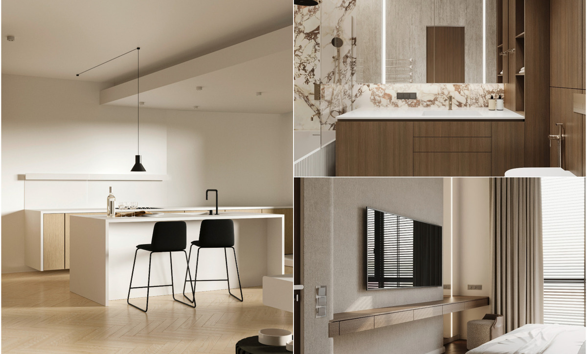
Pale oak or painted greige fronts, honed limestone or pale quartzite worktops, unlacquered brass or brushed nickel hardware, open shelving in the same timber as the units. Handleless fronts and continuous worktop runs keep the visual field quiet, which is what allows the material grain to become the point of interest. Apartment kitchens gain the most from this treatment, particularly in open-plan layouts where the kitchen sits in the same sightline as the living area — a condition we work with constantly in our duplex projects across Istanbul.
Splashbacks are worth spending on. A single slab of pale marble or a run of waxed plaster does considerably more for a Copenhagen Pale kitchen than tiling, because it removes the grout grid that fragments an otherwise calm surface.
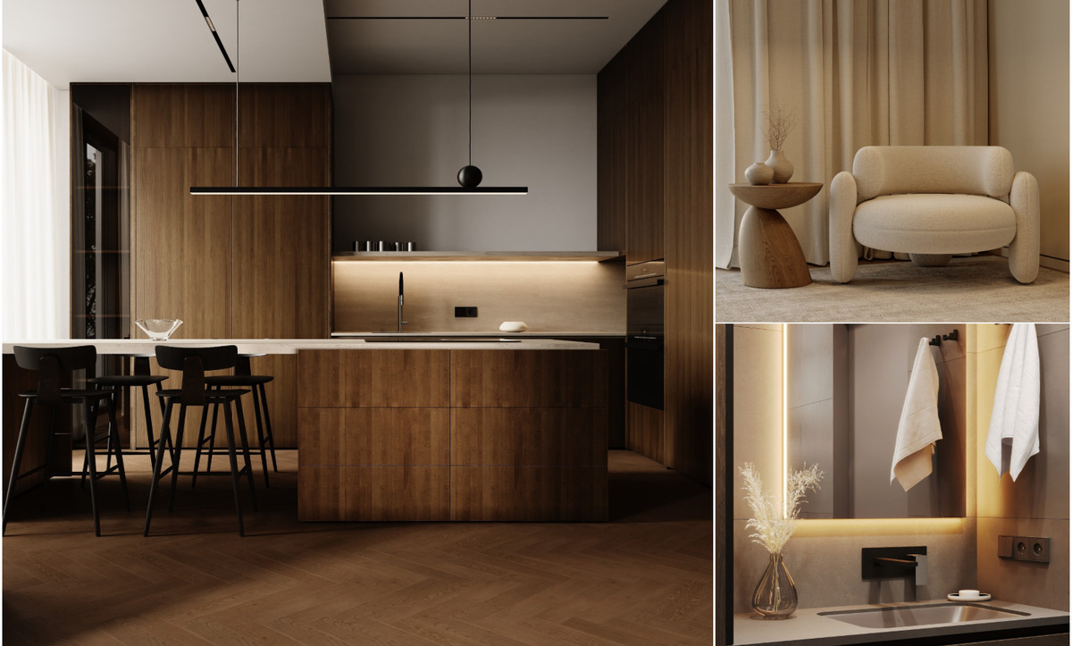
Bathrooms and the case for microcement
Bathrooms take to the palette with very little persuasion. Microcement or tadelakt walls in a warm bone tone, travertine or honed limestone floors, a large frameless mirror to double whatever daylight exists, and brushed brass fittings that warm as they age.
The continuous-surface argument applies here even more strongly than in the kitchen. A microcement shower enclosure without a single grout line reads as one calm volume, and in a small bathroom the effect on perceived size is significant. Underfloor heating pairs sensibly with stone in Istanbul winters, and it removes the need for wall-mounted radiators that would interrupt the surface.
Choosing the palette for a Turkish villa
Copenhagen Pale suits some properties far better than others, and the decision belongs at the start of a project rather than at the decoration stage.
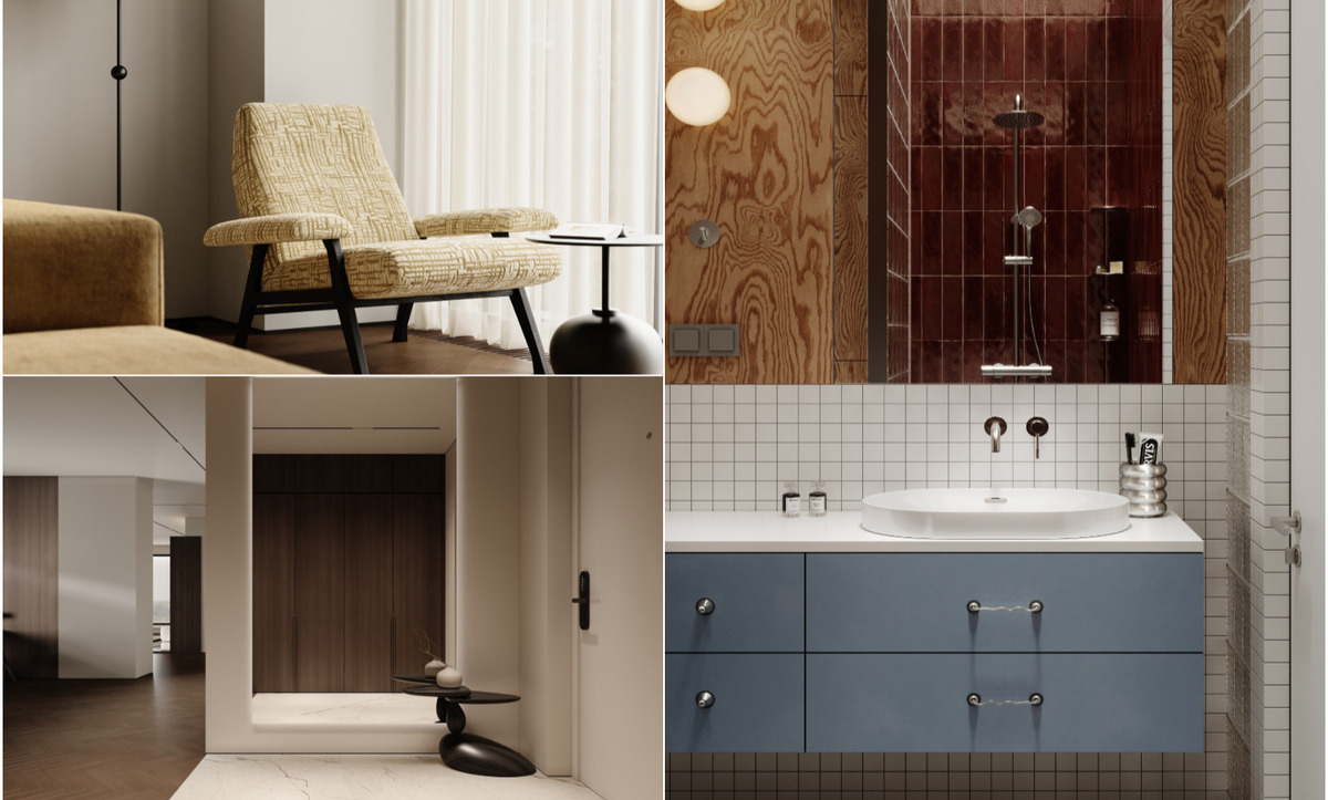
Contemporary villas with large glazed openings, generous ceiling heights and open circulation take the palette naturally — the architecture already supplies the light and volume the scheme depends on. Traditional Ottoman-influenced houses with smaller windows, carved timber detail and richer historical joinery ask for a different treatment, since a pale wash tends to flatten ornament that deserves to be read. Our guide to selecting a direction for a villa in Turkey works through that assessment property by property, and it is the conversation we have with clients before any paint colour gets discussed.
Plot orientation deserves the same early attention. A villa on a north-facing slope in Sarıyer receives soft, consistent light that flatters this palette all day. A south-facing coastal house receives glare, and there the scheme wants cooler undertones plus generous shading through deep overhangs or linen sheers.
Reading the palette against Istanbul taste
Istanbul clients arrive with a wide range of references, and Copenhagen Pale occupies a specific position among them.
The city's appetite runs strongly toward warm modern classic — walnut, brass, richer upholstery, a degree of formality in the reception rooms. A pale Nordic scheme reads as the quieter alternative, and it appeals most to younger clients, to second homes on the Aegean and Mediterranean coasts, and to apartments where light is the primary asset. Placing it within the broader range of directions currently popular across the city helps clients see what they are choosing and what they are setting aside.
Hybrid work is common and worth encouraging. Several of our recent homes pair a Copenhagen Pale living area with a warmer, more traditional formal salon, letting each room serve its actual function. The two register as one house because the timber species and metal finish stay constant throughout.
The three mistakes that flatten a pale interior
Most Copenhagen Pale schemes that fail to land share one of three problems.
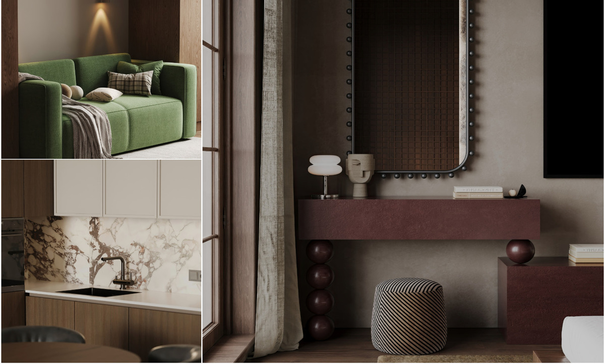
Insufficient tonal range comes first. A room assembled from a single pale value appears washed out and faintly institutional. A working scheme spans a real distance from near-white to mid-tone, with at least one element considerably darker than everything else in view.
Uniform sheen comes second. Matt walls, matt upholstery, matt floors and matt accessories together create a surface that reflects nothing at all. One or two points of gloss — a glazed ceramic, a polished stone tabletop, a lacquered timber tray — restore life immediately.
Cool lighting comes third, and it undoes more pale rooms than either of the others. Warm sources at multiple heights transform the palette. Cool overhead light drains it entirely, which is why the electrical layout deserves attention during the design phase rather than after the walls are painted.
Carrying the palette outdoors
Pale interiors gain enormously when the exterior treatment agrees with them. Limewashed or lightly rendered facades, pale stone paving, timber decking in a weathered grey and planting in soft silver-greens all extend the scheme past the glazing line.
For villa projects, the facade decision determines how far the palette can travel, and the choice between contemporary rendered volumes and heavier classical stonework changes everything downstream. Our comparison of contemporary and classical facade treatments for Turkish properties covers that decision in detail. Olive, lavender, santolina and ornamental grasses supply exactly the muted green register the palette wants, and all four handle the Turkish climate without difficulty.
Why the palette holds its value
Copenhagen Pale endures because it solves a real problem: it delivers calm without sterility, and it does so through material quality rather than colour intensity. Rooms built this way age slowly and improve while doing it. Timber develops patina, limewash softens, wool relaxes into shape, brass warms toward bronze. That quality is rare in any interior direction, and it is the strongest argument for treating Copenhagen Pale as a long-term decision rather than a passing taste.
Work with our design team
Our designers develop pale, material-led interiors for villas, apartments and duplexes across Istanbul, the Aegean and Mediterranean coasts, and the Gulf. Talk to us about a full scheme — palette, joinery, lighting and furniture specification — through our interior design and decor studio in Istanbul, or arrange a consultation with one of our design consultants.
+90 533 701 89 71 · info@algedra.com.tr