

The difference between a furnished apartment and a designed one usually sits in the joinery. Freestanding pieces fill a room; built-in millwork shapes it, absorbing storage into the wall plane, carrying the lighting, and giving each space a fixed architectural idea to work against. It is also the part of a project that has to be decided earliest, since it drives the electrical layout and the ceiling detail. Our interior design service page covers how the team develops joinery drawings alongside the floor plan.
The twelve examples below run through living rooms, bedrooms, kitchens and dressing rooms, and each one shows a different job that built-in work can do.
1. An arched niche and tall lit bays
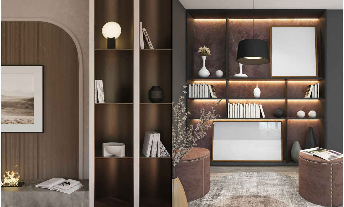
A reeded timber wall curves into an arched recess holding a linear fire and a stone bench, with slim bronze-lined shelving bays alongside. Elsewhere in the same apartment, dark shelving sits against a warm stone-effect back panel, lit from behind each shelf and paired with two velvet poufs.
Arched joinery softens rectangular rooms without any structural change. Line the recess in a different material from the surrounding wall — here, vertical timber battens against smooth plaster — so the arch reads as an intentional cut rather than a leftover alcove. Backlighting behind shelves needs a 20 to 30 millimetre gap to avoid hot spots.
2. Sculpted panels and a stone media wall
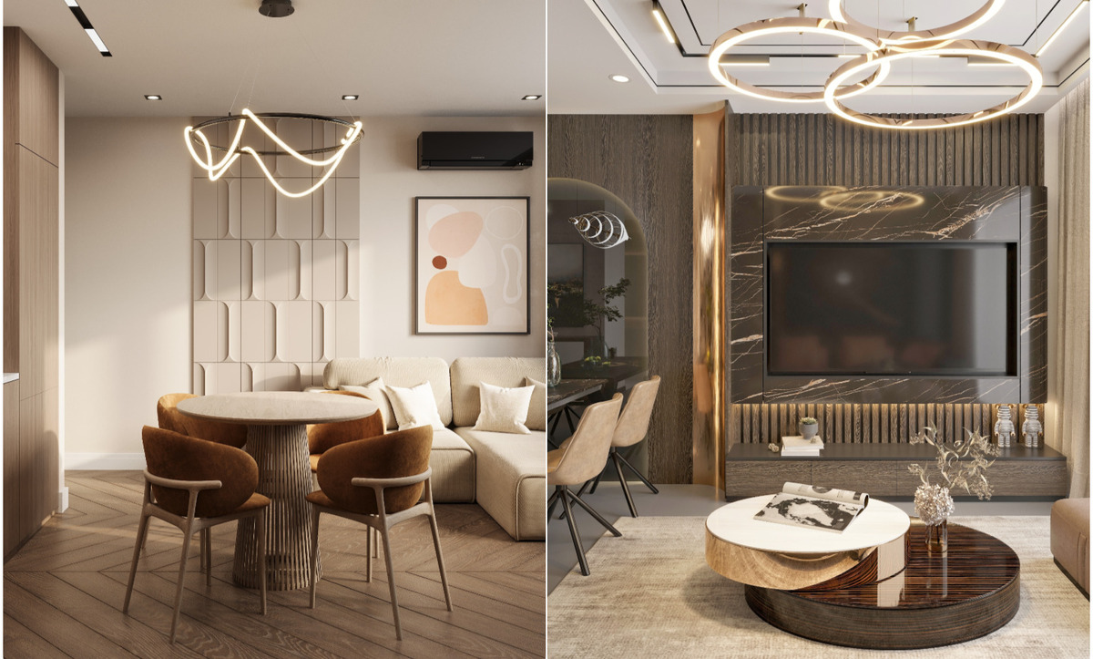
A three-dimensional cast panel rises behind a round dining table in a compact apartment, with a ribbon light suspended in front of it. In the living area, a dark marble media panel carries the screen, framed by fluted timber and a slim lit reveal.
Sculpted wall panels earn their place in small apartments precisely because they take up almost no depth. Forty millimetres of relief supplies the interest that a piece of furniture would need half a metre to provide. Keep the media panel material darker than the surrounding joinery so the screen disappears into it when switched off.
3. Joinery that carries an open plan
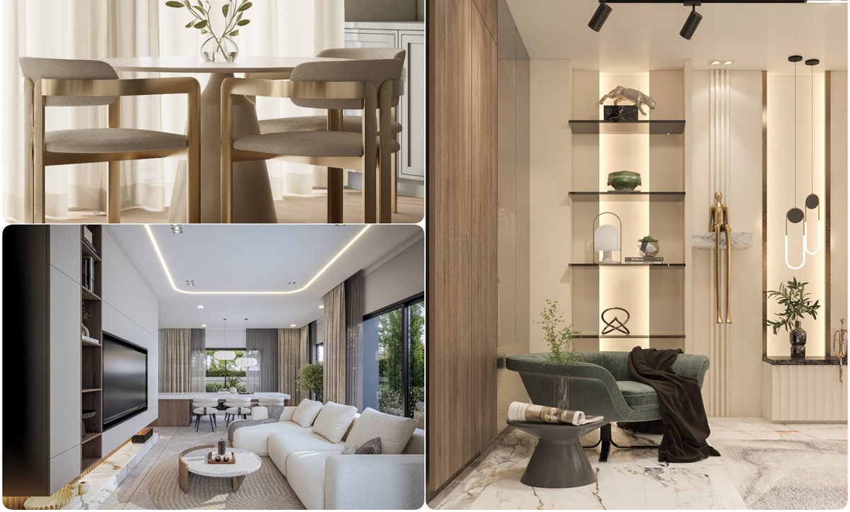
A long living room runs into a dining area at the far end, with a full-height joinery wall on one side holding the screen, closed storage and open shelving in a single continuous run. Nearby, a narrow lit niche with floating glass shelves sits beside a marble console.
Continuous joinery is the quietest way to unify an open plan. One material, one horizontal datum line, one lighting temperature across the whole run, and the room reads as a single space rather than two adjacent ones. Our notes on maximizing space in studio apartments cover the same principle at a smaller scale.
4. A slatted wardrobe front with an integrated desk
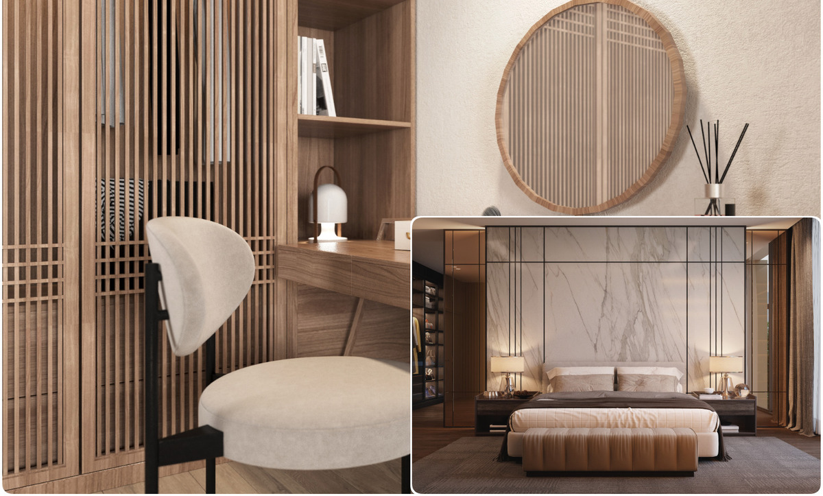
Vertical timber battens run across a wardrobe front, and the joinery turns a corner to become a desk with open shelving above it. In the adjoining bedroom, a marble headboard panel sits inside a fine black grid.
Slatted fronts suit rooms that need storage without visual weight, since the shadow lines break up what would otherwise be a flat expanse of door. Building the desk into the same run means the two elements share a carcass depth and a single lighting circuit. More on this arrangement in our guide to multifunctional spaces.
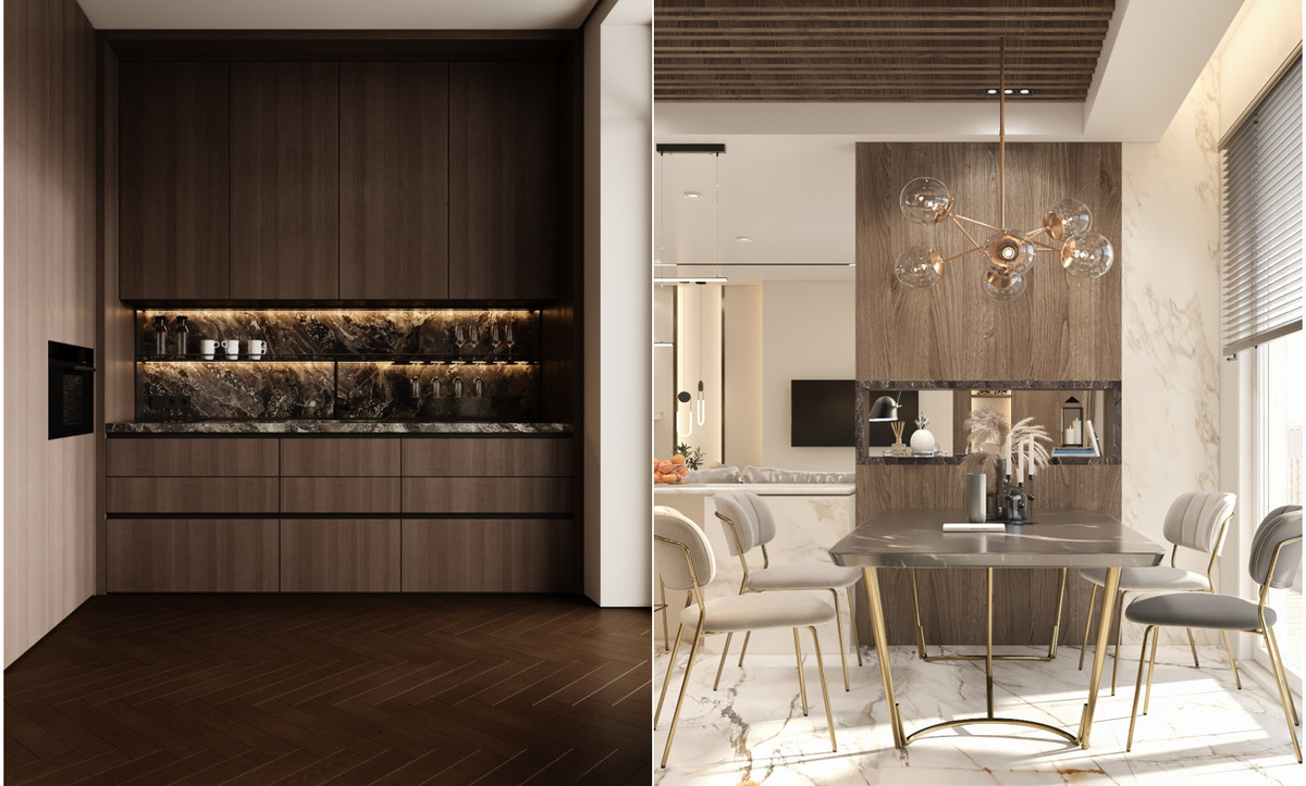
5. Kitchen joinery in dark timber
A tall run of dark timber cabinetry holds a backlit stone shelf at working height, with the oven recessed into the flank. In the same apartment, the dining table sits against a timber panel holding a dark stone display niche.
Full-height kitchen joinery gives a small apartment its storage back. The lit shelf breaks the run at roughly 1.4 metres, which stops a wall of doors from reading as a cupboard. Continuing the same timber into the dining niche ties two functions together across a partition.
6. A dressing room behind framed glass
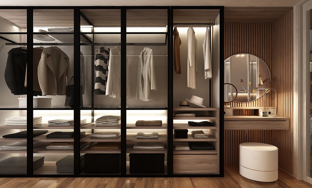
Black-framed glass doors front a walk-in wardrobe with lit shelves and hanging rails, and a reeded timber panel wraps the vanity corner with a round mirror above.
Glass fronts work when the contents are worth showing and the lighting is built in. Allow 60 centimetres of depth for hanging, 40 for folded shelving, and light every shelf rather than the room. For the full treatment, see our dressing room interior design ideas.
7. Full-height panelling across a living and dining space
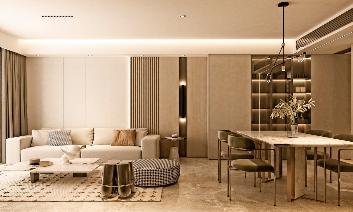
Beige panelling runs the length of one wall, interrupted by a reeded section and a slim vertical light, then continues into a lit display unit behind the dining table.
Panelling a full wall to ceiling height raises the apparent proportion of a standard apartment room. Keep the panel widths consistent and let the reeded section fall where the eye lands — usually behind the sofa or at the transition between two zones. The lighting inside the display unit should sit at a warmer temperature than the general lighting so it reads as a highlight.
8. A marble panel wall in an open kitchen and living room
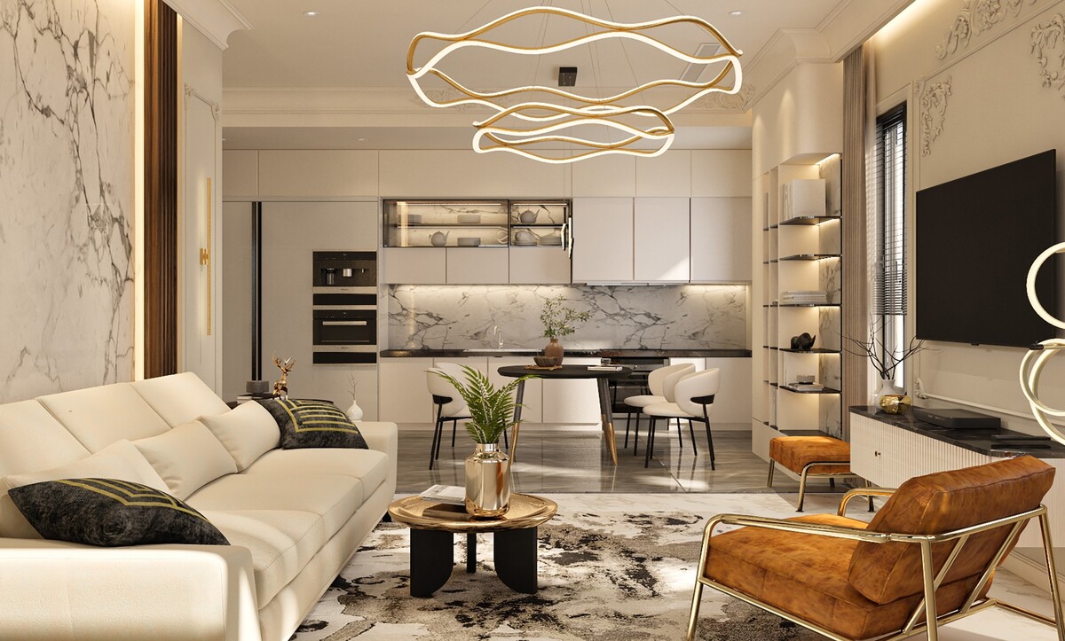
Marble panels frame a doorway, slim lit shelves float against the wall, and a ribbon chandelier crosses the boundary between the seating and the kitchen.
Running a single decorative material through both zones of an open plan holds them together, particularly when the furniture differs sharply. Slim shelves at 25 to 30 centimetres deep supply display without projecting into circulation. Our post on multidimensional lighting covers how to layer the fixtures across a space like this.
9. Marble and a curved plaster arch in the kitchen
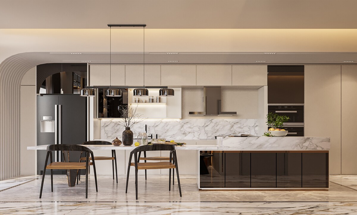
A book-matched marble backsplash rises to the underside of the wall units, with an island in the same stone and a curved plaster arch marking the entry from the hall.
The arch is the piece of built-in work doing the most here. A curved reveal at a doorway costs little and gives a kitchen a defined threshold, especially in an apartment where the kitchen opens directly onto a hall. Continue the counter material up the wall rather than stopping at a standard splashback height.
10. Marble, brass and gloss in a city apartment
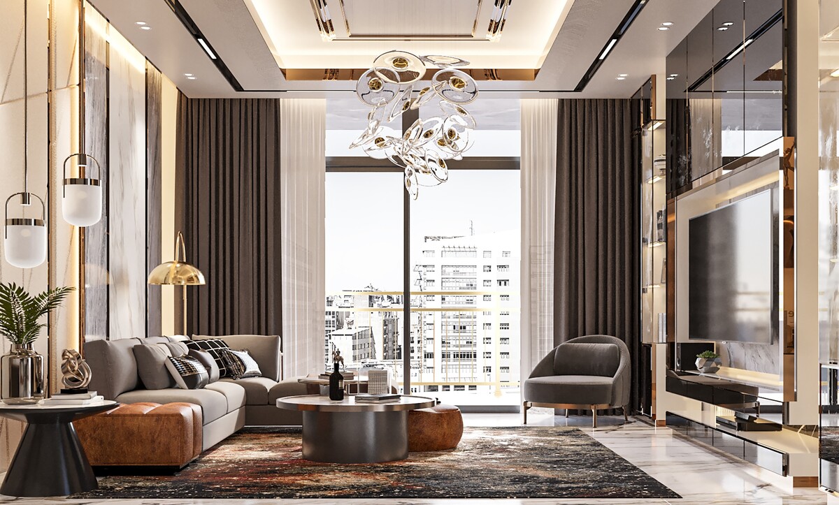
Marble panels with brass trim line one wall, and a high-gloss joinery run holds the screen and lit display bays opposite, with a full-height window between them.
Gloss finishes suit apartments with a view, since they return daylight into the room. Keep the brass trim to a consistent width — 10 to 15 millimetres reads as detailing, anything wider starts to compete with the stone.
11. A timber wall in a double-height room
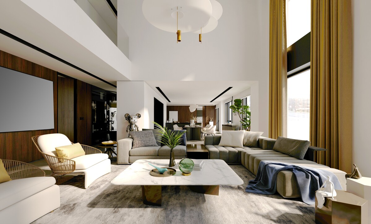
A full-height timber-clad wall carries the screen in a double-height living room, with the dining area visible beyond a low partition.
Tall rooms need their joinery to reach. A media wall stopping at 2.4 metres in a room twice that height leaves an awkward band of blank plaster above it. Run the cladding to the ceiling or to a clear datum, and let the material change above rather than simply ending.
12. A marble headboard wall inside a black grid
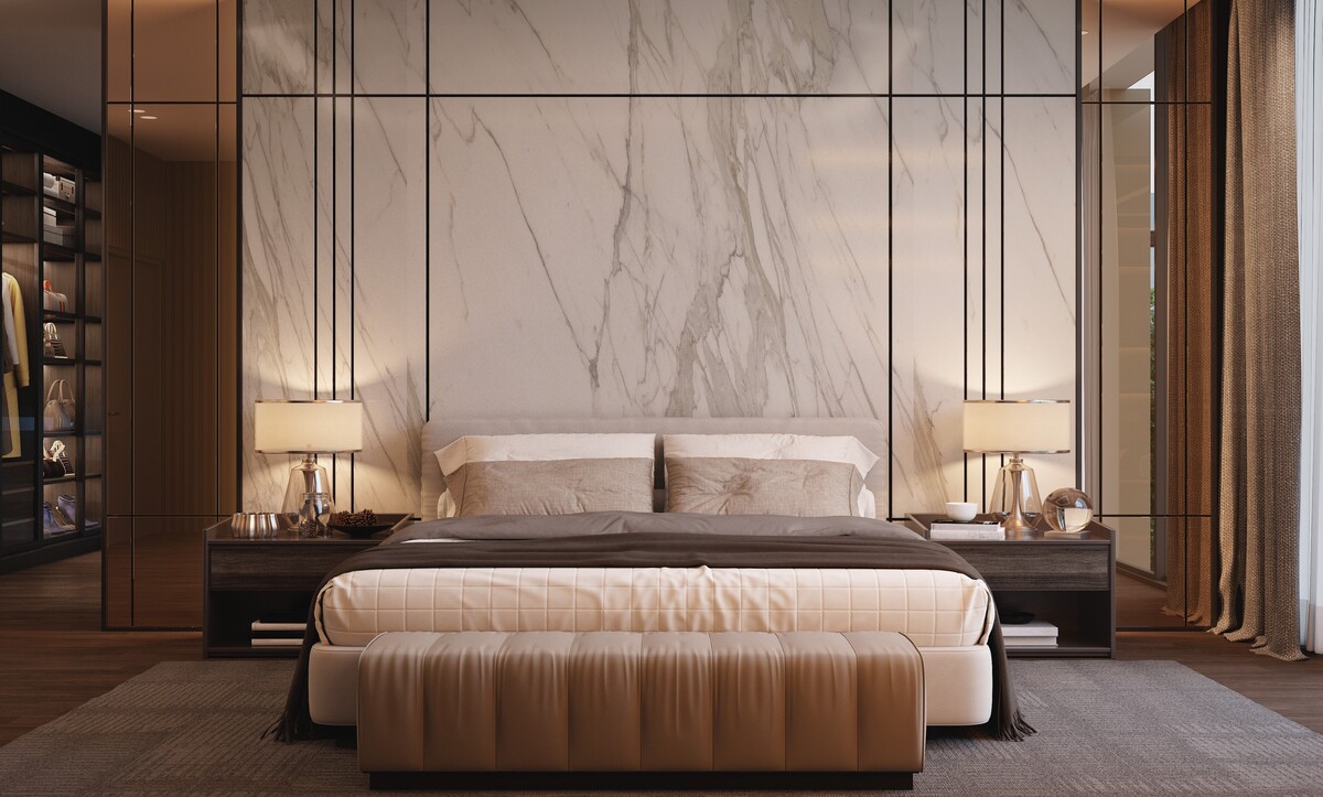
A single marble panel spans the bed wall, divided by a fine black metal grid that continues onto the adjoining glazed wardrobe fronts.
Using one detail across two functions — the headboard and the wardrobe front — makes a bedroom feel resolved. Set the headboard panel wide enough to take both bedside tables within it, so the composition centres on the bed rather than on the wall. Our bedroom styling notes go further into the surrounding pieces.
Getting the joinery specified early
Built-in work touches the electrical plan, the ceiling detail and the flooring layout, so it belongs in the first round of drawings rather than the last. Decide the lit reveals, the shelf depths and the material changes before the walls close, and the room arrives finished rather than furnished.
Planning an apartment or villa interior? The Algedra team works across interior design, architecture and landscape from a single studio, with projects in Istanbul, Dubai, Doha, Riyadh and the wider Gulf. Get in touch to talk through your space, or explore our interior design service to see how we develop joinery from concept through to shop drawings.